
Phase II
The power of yellow
Would I be able to enhance the vitality this particular colour by introducing an additional shade of yellow? How ought the planes of this colour relate to one another such that the two yellow shades both “experience well-being” and are able to unfold their full power? What approach ought I to adopt so as to best preserve the harmony between the two shades of this colour? At what point, and under what conditions do we perceive the two colours beginning to rival one another, along with the consequent loss of their distinctive chromatic vitality?
Canvas
Acrylic on canvas


Colour tonality: initially two shades of yellow (strong lemon yellow and warm orange yellow), followed some few years later by limpid yellow, initially accentuated, later also as a surface, occasionally black or white to enhance or assuage.
Experiments of partly matt, partly lustrous surfaces in interplay.
Materials: canvas, wood, metal, and later transparent plexiglass.
Metal
Acrylic on aluminum

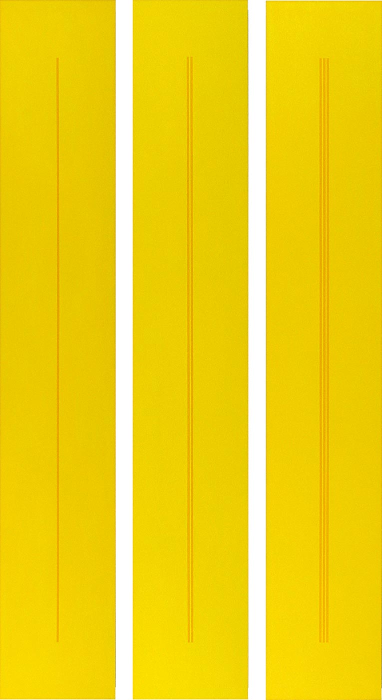
I favour a highly unstructured surface, such as canvass, metal, wood and acrylic glass. In my painting, the brushwork is barely visible so as not to disrupt the colour’s purity and aesthetic mood. A clear delineation of the colour surfaces, which nevertheless coalesce into harmonious concord lend the paintings a quality of serenity, of puissance and of lucidity.


Wood
Acrylic on MDF
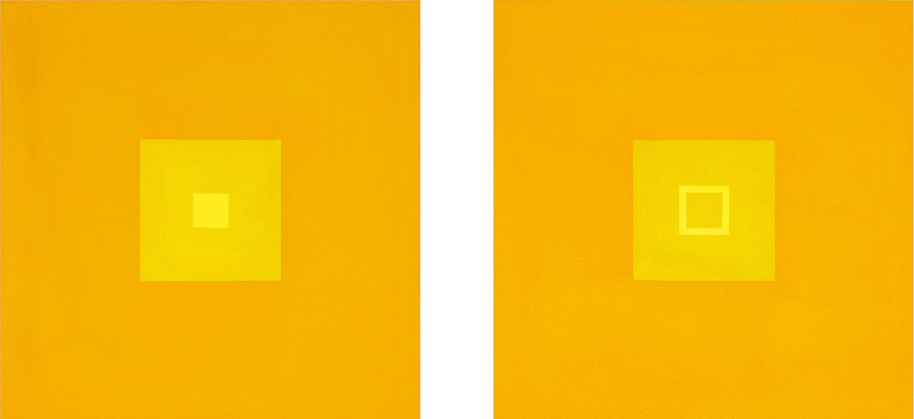

The many years of working with only three bold and clear hues of yellow have shown me that this colour both opens up and enlarges perceptual spaces. This effect may also be sensed in the mind. Thus, in my eyes, yellow reflects freedom, tolerance, light and warmth.

… that exemplary figure and architect together with his influential doctrines which were to later become especially legible in the pictorial world of Ina von Jan. Ortner, by contrast, drew on his studies at the Bauhaus and his acquaintance with Kandinsky and Mies van der Rohe. Hence, it was here that one of the most far-reaching lines in Concrete Art was foreordained. Initially recognisable were the stylistic devices, such as right-angled linear structures and their relationships to surfaces. And the colour blue took precedence over red and incidental yellow. This amounted to a good schooling in order with rules. …
Citated from Eugen Gomringer, 2010, »Concrete Art present with Ina von Jan«
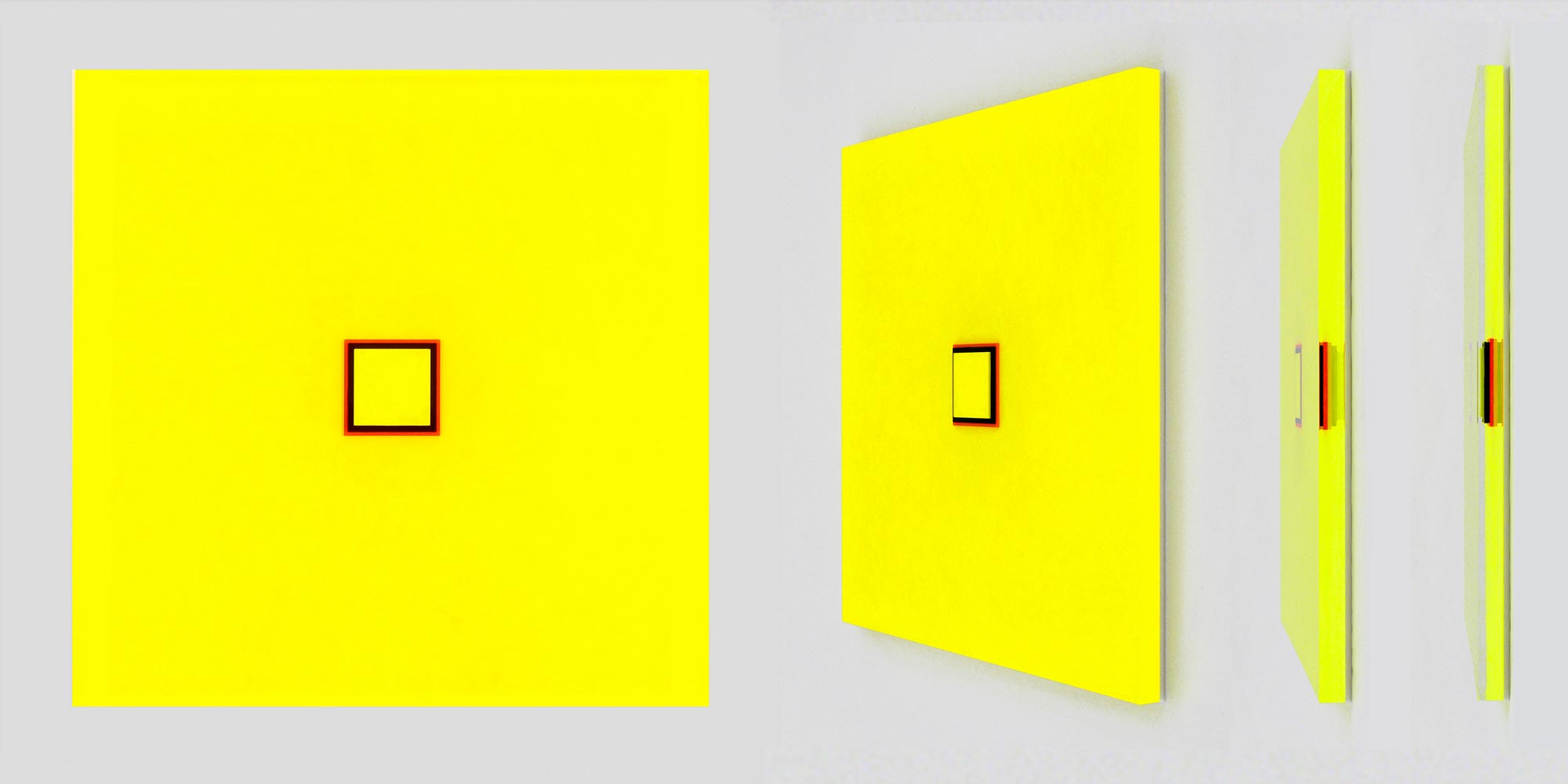
Acrylic glass
Acrylic on acrylic glass
In 2011, fascinated by acrylic glass as a material, I began applying colours with the brush to different levels of a preformed acrylic glass object I had designed. In this way, a depth effect began to emerge which, depending on viewpoint, assumed different forms.


