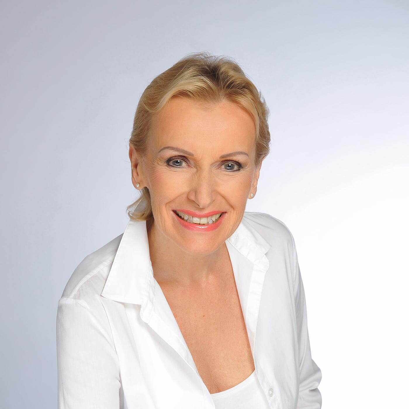
Ina von Jan
About her work
My interest centres primarily on the exploration of colour, namely, on the various modalities of its perception, its effects together with its luminosity and intensity in various arrangements and inversions.
It is with the energy of colour, its autonomy and its facility as a universal language – liberated from the burden of all such content as critique, violence, and symbolism – that I endeavour to move people and to bring them together. Every human being, irrespective of nation and culture is capable of beholding the language of colour in and for itself, and is thus capable of grasping its sustaining potential. Thus, I personally find that the colour yellow signifies freedom, tolerance, individual evolvement and happiness. Yellow, embodies powerful and positive energy for all people, much like the sun which floods all of us equally, throughout the world, with warmth and life.
Whereas during the initial phases of my work as a painter the significance of form held virtually equal value to that of colour, in more recent years colour itself has become the most important creative medium. I originally began working with primary colours, and with black and white.
My boundless passion for colour in art was first inspired by the fascination I experienced for the sheer colourfulness of nature – above all, the indescribable impression that the chromatic energy as found in the tropics, both on land and under water, had on me. For many years I was particularly entranced by the colour yellow. I find that yellow embodies the force of the sun, of light, warmth, life, positivity, creativity and sensuousness. For over ten years my work was dedicated to exclusively researching this most luminescent of colours: would I be able to enhance the vitality this particular colour by introducing an additional shade of yellow? How ought the planes of this colour relate to one another such that the two yellow shades both “experience well-being” and are able to unfold their full power? What approach ought I to adopt so as to best preserve the harmony between the two shades of this colour? At what point, and under what conditions do we perceive the two colours beginning to rival one another, along with the consequent loss of their distinctive chromatic vitality? This thoroughgoing study of two, and later three shades of yellow, occasionally with the addition of black or white, enhanced my sensibility of colour compositions and the affiliated laws of harmony governing these.
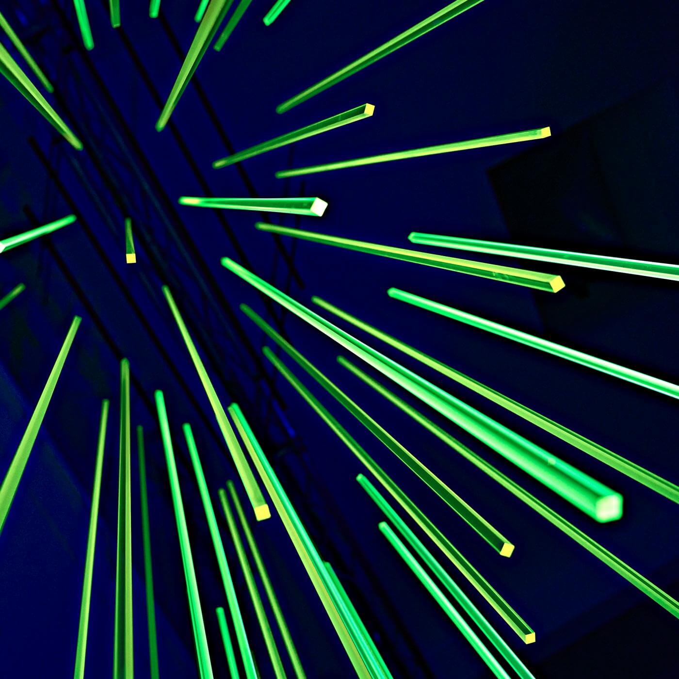
I favour a highly unstructured surface, such as canvass, metal, wood and acrylic glass. In my painting, the brushwork is barely visible so as not to disrupt the colour’s purity and aesthetic mood. A clear delineation of the colour surfaces, which nevertheless coalesce into harmonious concord lend the paintings a quality of serenity, of puissance and of lucidity. In 2011, fascinated by acrylic glass as a material, I began applying colours with the brush to different levels of a preformed acrylic glass object I had designed. In this way, a depth effect began to emerge which, depending on viewpoint, assumed different forms. In my most recent works I have abstained from painting altogether. Coloured, in part opaque, in part transparent florescent surfaces are composed as a pictorial object with a clear arrangement. Bold colour contrasts alternate with fluorescent contrasting lines, and lead to a sense of movement and light. A playful communication between the different fields of colour emerges.
I thereby draw on geometric forms that radiate the greatest possible tranquillity. The predominantly rectangular composition of the constructions and my predilection for the square facilitate a powerful concentration on the dynamic interplay of colour. Works with similar pictorial construction brought into coloured interaction by way of juxtaposition induce a pulsating effect. In the pictorial design, formally oriented on reduction and simplicity, an outward movement can be perceived – a refulgent and dense luminosity.
The juxtaposition of UV-light – an especially entertaining part of sunlight – and daylight in my series of works entitled “Compositions of Light“, demonstrates just how potent is the perception of the colour in each of the light types used.
© Ina von Jan, 2018
Translated by Justin Morris

Biography
- 1954
Born in Coburg
- 1966 – 1972
High School of Arts and Music in Coburg
- 1972 – 1974
Academy of Design in Bayreuth
- 1989 – 1997
Studied under Professor Rudolf Ortner
- 1989
Member of GEDOK, Munich
- 1990
Member of the Professional Association of Fine Arts (BBK) Munich
- 1990 – 1991
Deputy State Delegate of the Professional Association of Fine Arts (BBK) Munich
- 2000
Member of the International Association of Art / UNESCO
- 2013
Art Award 2013 of the district Fürstenfeldbruck
- 2018
Nominee for the 5th International André Evard Prize, Kunsthalle Messmer, Riegel am Kaiserstuhl
- 2024
Nominee for the 7th International André Evard Prize, Kunsthalle Messmer, Riegel am Kaiserstuhl
- 2025
Jury member for the 2025 Art Prize of the District of Fürstenfeldbruck
Solo and group exhibitions in Germany and abroad. Works in private and public ownership in Germany and abroad. Lives and works in Starnberg.
